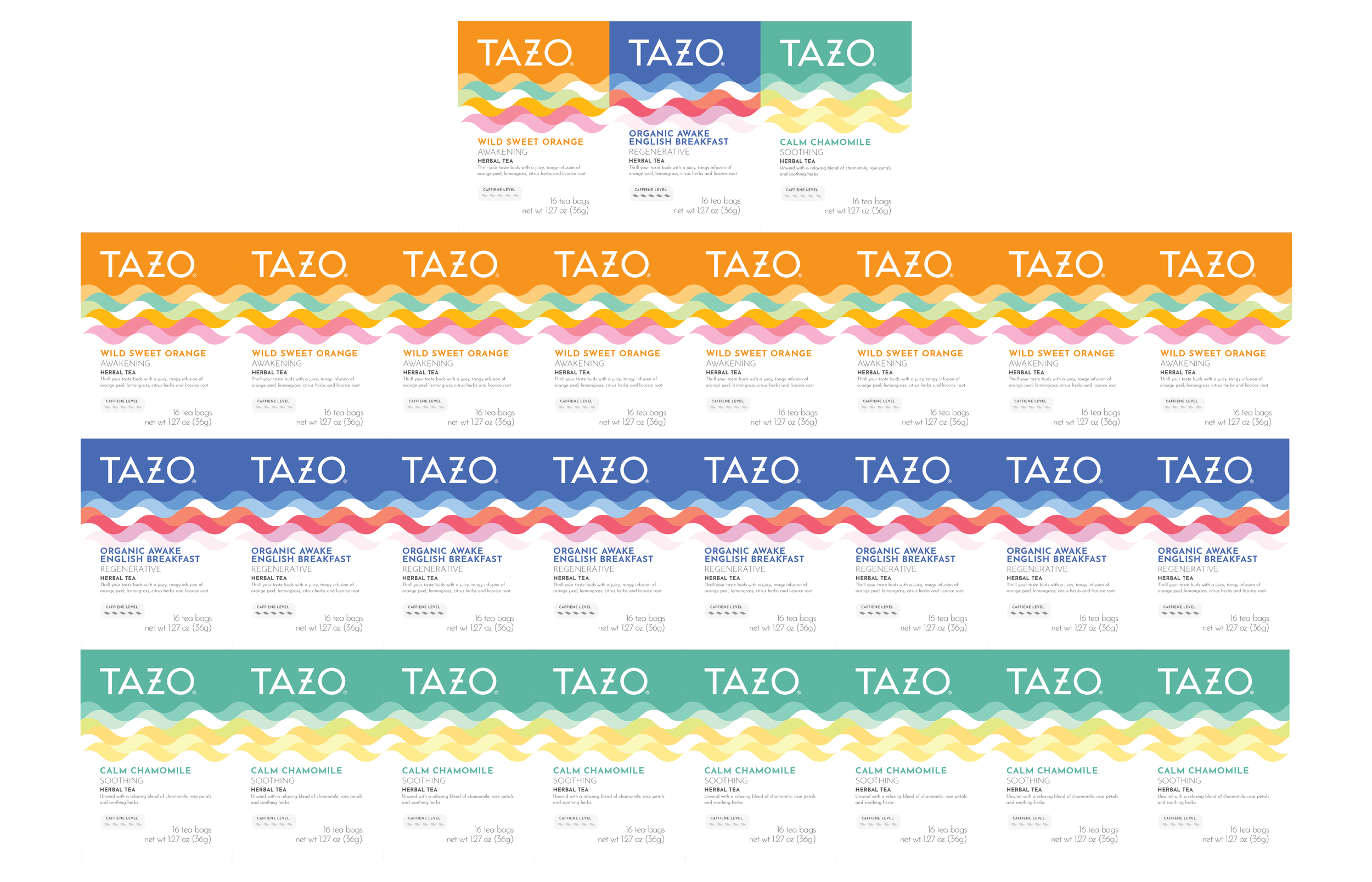
Tazo Tea Redesign
Reinvigorating Tradition: The Tazo Tea Packaging Design
Overview
TAZO is a well-known tea brand around the world. This case study explores a new way to transform and revitalize the brand to attract new and current customers. For this project, I focused on the actual meaning of TAZO; river of life in Romany. I wanted to incorporate that meaning into the design of this rebrand to unify the brand even more.
The Challenge
The tea market is highly competitive with so many different types of tea. It was important to take in account that I wanted to create something that would stand out from other tea brands.
There are also many risky things that come with a rebrand. I did not want to completely change a well-established brand into something that it wasn't. I still wanted to keep the same feeling that TAZO has created with their current packaging. Their packaging is very colorful and minimal. I still wanted something similar to that but more evolved. I also wanted to create a sustainable system that can be easily manipulated for other flavors.
Project Objectives
Refresh Packaging Design
Attract New and Existing Customers
Brand Identity Enhancement


